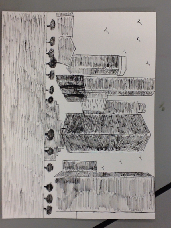
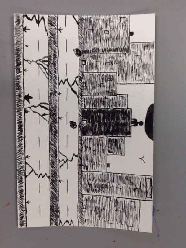
This is a cityscape of Anaheim CA. I chose Anaheim not because of the fantastic skyline, but because this is where I was Born. In this work, I used the techniques of hatching and crosshatching. I think that the shapes and dimensions of the buildings provide a sense of depth and reality to the scene. Personally, this means a lot to me, because this is where I grew up and where I was born so for me it was good to connect with the drawing on that level.
This is a painting of a picture I took of a sunset behind this row of trees. One of the skills that i used in this painting was working with the background prior to the foreground, and also, I learned a new technique with making the clouds to make them appear cloud like rather than just shapes. Color is one of the biggest elements and the contrast between the dark in the foreground and the light in the background. To me, I've tried painting landscapes throughout the semester and I think that this one was the most successful in capturing a reality of the picture. This is a still life drawn in pencil colored with colored pencil of a rose growing from the concrete. One skill used in the drawing is one point perspective with the sidewalk and street following that perspective pattern. For this piece the biggest element is definitely the color of the rose juxtaposed against the dull gray color of the streets. There is a lot going on in terms of lines and shapes but the color is the dominant element. The inspiration for this piece came from watching a recent powerade commercial that read the poem by Tupac about roses growing from the streets symbolic of great people striving through difficult situations. For me, while I don't live amongst gang violence and other backgrounds as other people who take relevance to this idea, however it connects with me personally with the fact that greatness can come from anywhere and it doesn't matter where you come from, but it's where you want to go. The original painting is of an evergreen tree and another red tree with a background of a blue sky with some clouds. I attempted to reflect the same images in the second in an untraditional manner. One skilled used in the work is working with the background first, and then moving on to the foreground in order to prevent from painting the same things again. One of the biggest elements of art present is definitely color. The entire point of the project was to use natural and contrasting colors. I think it was cool to have a painting go from natural to abnormal and still be apparent that it is the same image. This is a pen and ink drawing of a cityscape, with one person present. It's apparent that something has gone wrong, leaving only this one person. One skill that I learned and used was how to draw in ink. It is a lot different than pencil, especially in terms of shading. I learned the techniques of hatching and cross-hatching. Some of the elements most focused on are the lines, because of the buildings and roads, and especially in cities, these buildings and streets are rather straight. I think that it created a meaningful portrayal of a "last man on Earth" scenario and I think that I used the ink well, and really enjoyed using the ink for drawing. These are the calligrams that I made. The first one is just the first quote that came up when I googled "short inspirational quotes" so I decided to attempt to inspire anyone who looks at it. The words are meant to form a dream cloud. The second, the one word is a manatee, and I thought it would be a good subject, because most of the letters have pieces missing from them, just like the manatees themselves, due to the propellors from boats. The third is the theme song to my favorite childhood tv show, "the little einsteins" and I just thought it kind of fun to make. The elements of design used are shapes and lines especially, but one skill that was needed for the project was knowing how to manipulate the letters to create a bigger picture. I know that these were meaningful to me, and I think that at least two of them have a much deeper meaning for others as well. This is a painting of a rhododendron located in the front of a school. This close up angle creates a unique angle and perspective on a typical well known plant. One skill I used in painting this time was working from the background to the foreground, saving myself time and effort of painting and reprinting. I really like the different colors and shades of green that are present in this painting, and I think that they blend together to create a realistic interpretation of the actual colors. These colors and the blending of them create a painting that accurately portrays the actual plant. This is the surrealism final drawing. It depicts 4 roads converging on a central point, each similar, but different which is represented by the different colors. In this project, I learned about surrealism and the components of it that I would've never experienced before. These elements are present in the work, it shows the use of soft images and also the odd combos. These soft, malleable images in conjunction with the straight lines and shapes create a unique image that I enjoyed creating and I enjoy looking at it as well. This is a painting of a picture I took of a morning sunrise over the Puget Sound from Whidbey Island. It looks like a sunrise over the water. One of the skills that I learned and implemented in this painting was working from top to bottom to save myself from having to repaint details that had been covered up by the sky and ocean. The shape of the water and the land, also there's a lot of space and color in here. I really liked this picture, so I think the painting is a good representation for me of this picture. This is a supposed self portrait. It is drawn in the 3/4 view to give the best effect of my face. I see many good similarities between the drawing and my actually face. I think the shape and placement is really well done to match my face. I learned how to correctly shape and draw a head and also correctly place the basic components of a face. I think that lines, shapes and forms are really prevalent in my drawing. But mostly shapes. I think the usage of the size and placement of these shapes is proportionate to the rest of the shapes and that brings the drawing together well. I never thought that I'd be able to draw something that actually resembles myself and I think that, through the use of lines, shapes, and shading, that I have been able to accomplish this in the self portrait project. |
AuthorWrite something about yourself. No need to be fancy, just an overview. Archives
June 2015
Categories |